 About RADi
The design grid explained
Additional RADi features
Provided editors
System requirements
The Development process with RADi
Designing GUIs is mainly a matter of positioning components on some kind of panel and defining the layout's resizing behaviour.
Java addresses this needs by providing several layout managers, each with its own advantages and constraints.
GridBagLayout is Java's most flexible layout manager but not flexible enough and not very intuitive to use.
RADi is based on the concept of a design grid, which is both easy to understand and intuitive to use. The RADi editor provides the visualization of the design grid (which is internally implemented as a
LayoutManager).
|
| Login Form Example 27 |
With RADi's design grid you can
| Position components accurate to a pixel. |
|
| Interactively specify the layout's resizing behaviour (very fine-grained if you wish). |
|
| Create almost any layout you can think of (by placing other grids inside a grid). |
|
| Easily re-order components with drag and drop. |
|
| Easily change the grid by adding, removing or re-ordering columns respective rows. |
(RADi can also handle
null layouts and has some nice features to help you master desktop panes and layered panes - see JLayeredPane and JDesktopPane.)
The design grid explained Top of page
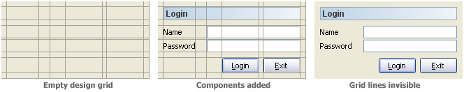
Similar to a table, a design grid divides a rectangular area into a number of columns and rows. We refer to the intersection of a row and a column as a grid cell. Each grid cell can either contain a component or can be empty.
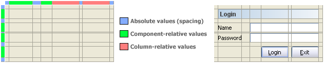
Column width and row height can be specified in one of three ways:
|
Specifying an absolute value in pixels. This allows you to define intercomponent spacing. (But if you place a component in a cell with absolute width/height and the preferred width/height of the component exeeds the values defined, the component's preferred size will always be respected.) |
|
| Specifying a component-relative value. Column width and row height are calculated from the maximum preferred size of all components in that column/row. |
|
| Specifying a column-relative value. Two (ore more) columns/rows shall be of the same width/height (which will be the width/height of the largest column/row involved). We refer to this as linking columns/rows. |
|
| The 'Login' button and the 'Exit' button have the same width (independently of the label text) |
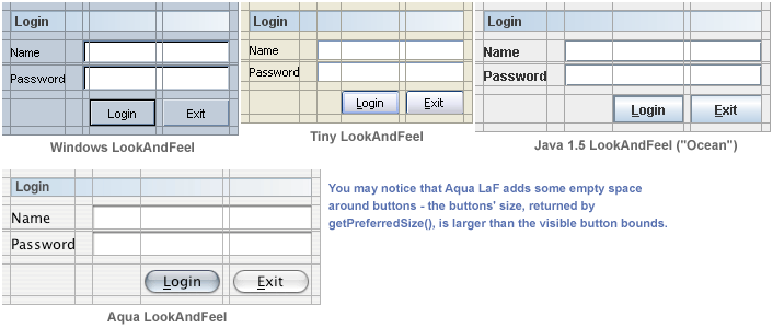
With Java, component sizes are both look and feel dependent and platform dependent. Specifying component-relative values ensures that your layout will work with every LookAndFeel on all platforms.
|
| Component-relative values are look and feel dependent, absolute values are not |
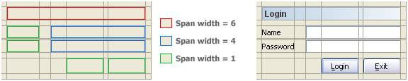
A component can span several columns/rows, this is controlled by its
span width respective span height property.
|
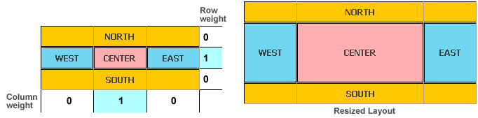
Resizing behaviour is specified by applying resize weights to rows and/or columns. A value of
0 means that the column/row should not enlarge, whereas values > 0 allow the column/row to enlarge. The free space is divided proportionally among columns/rows having a resize weight > 0.
|
This layout simulates the resizing behaviour of Java's BorderLayout
|
|
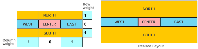
| This layout reverses the resizing behaviour of the previous layout |
| Note: The RADi editor can simulate a resizable frame so you can specify resize weights interactively - you will immediately see the result of changing resize weights. |
Anchors and cell insets help you positioning components.
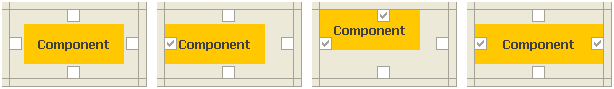
|
| Each grid cell has four anchors: Top, Left, Bottom, Right |
|
| Without active anchors, a component will be horizontally and vertically centered in its grid cell. |
|
| By selecting an anchor you fix a component at either side of its grid cell. |
|
| Selecting opposite anchors will stretch the component. |
Cell insets allow you to fine-tune a component's position relative to its grid cell.
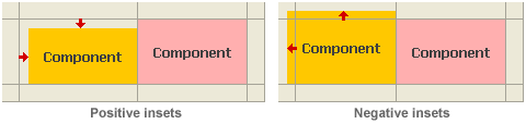
|
| Cell insets can be positive or negative. |
Additional RADi features Top of page
There are some common features, every Java GUI builder should support:
|
|
Allow the user to specify a FocusTraversalPolicy for frames and dialogs (see Defining the FocusTraversalPolicy).
|
|
|
Allow for internationalizing layouts using properties files (see Internationalization).
|
|
| Allow for importing custom Beans (see JavaBeans(TM) Support). |
|
|
Allow for LookAndFeel switching.
|
|
| Provide appropriate property editors (see Provided editors). |
The author spent some time thinking about what could be done to speed up GUI design, to have a presentable GUI demo as soon as possible:
|
| With RADi, you can define TableCellRenderers (defined with the table model), TreeCellRenderers and ListCellRenderers. |
|
| You can define popup menus, including the necessary wireing to be triggered (see Popup Menu Properties dialog). |
|
|
By providing a CardPanel component, RADi supports Java's CardLayout. You can edit the card's constraints, you can easily rearrange cards and even define a controller component that switches cards (see CardPanel).
|
|
|
Every RADi panel implements Scrollable (see The Scrollable definition).
|
|
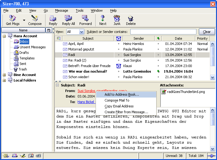
| Mozilla Mail Client |
Enhance the appearance of your UI:
|
|
With RADi, every component able to display text can also display antialiased text (by means of a textAntialiased property).
|
|
| RADi panels can display background images (see Displaying background images). |
|
| Example with antialiased text and background image (example courtesy of Comex, www.comex.de) |
Mastering complex layouts:
|
| RADi provides some kind of global property editor. It allows, for example, to change the font for all labels of a layout (or a definable set of layouts), or to change the border kind for a whole set of panels (see Change Global Properties dialog). |
|
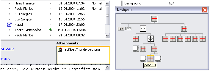
| The Navigator window provides an overview of the container hierarchy. |
|
While the mouse cursor is above a container icon, this container is marked in the layout. As you click a container icon, the container's content will be displayed. | |
|
| Navigator and marked container |
Provided editors Top of page
Beneath a
KeyStroke editor and a simple HTML editor (for multi-line labels, tool tips, etc.), RADi provides some, partly rather special, editors:
|
|
Action Editor | screenshot |
|
|
Border Editor | screenshot |
|
|
ButtonGroup Editor | screenshot |
|
|
Color Editor | screenshot |
|
|
Font Editor | screenshot |
|
|
Formatter Editors | screenshot |
|
|
LabelTable Editor | screenshot |
|
|
List/ComboBox Editor | screenshot |
|
|
Menu Editor | screenshot |
|
|
ScrollableDefinition Editor | screenshot |
|
|
SpinnerModel Editors | screenshot |
|
|
StyledDocument Editor | screenshot |
|
|
Tab Editor | screenshot |
|
|
TableModel Editor | screenshot |
|
|
Tree Editor | screenshot |
System requirements Top of page
Both RADi and the RADi runtime library require Java 1.4 or later.
RADi requires at least 128 MB free RAM and a screen resolution of at least 1024x768.
The Development process with RADi Top of page
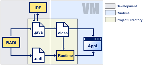
There are three main actors in the development process with RADi: your IDE, RADi and the RADi runtime library.
The following graphic shows how things fit together:
|
| The RADi infrastructure |
|
|
For every layout you create, RADi saves a layout definition file and exports a Java source code file. These files should go to your IDE's project directory. |
|
|
Using your IDE you either extend or edit the exported class. You also run the compiled application from your IDE. |
|
|
As you run your application, the GUI class calls the RADi runtime library. The runtime library processes the layout definition file and creates the UI. |